TL;DR
Even though creating visualizations in R can be achieved with often only 2 lines of code, the initial output is not that visually appealing. In this post we will cover how to style your plots and provide a template of code which should make beautiful plots in R a bit easier. We will also cover how to make panel plots and how to export your files to comply with journal dpi requirements.
Introduction
For most, graphing in R can be a bit daunting because of course, why would you spend your time to learn something that can easily be completed in excel in a few clicks and far fewer error messages! Well for me, the true benefit of using R for data exploration, where you can set up your graphing code for one plot, and then reuse is for other purposes. Therefore whilst making a plot in excel is far quicker, many of you will know the frustration of when you want to use the same theme for a different set of data.
We have covered the basics of plotting in the previous post, but now we wanted to share the basic set of code which will allow you to create publication ready plots, which you can reuse time and time again. Combing plots is also quite a useful way to reduce the amount of figures, which is often brought about by trying to fit more data (you worked hard on it and why shouldn’t it be included!) into journal/submission guidelines and so learning how to produce panel plots is quite useful.
Finally, we will be cross posting some of the same code within the exporting items from R post to show you how to make sure your figures conform to journal submission requirements. No more… your figures are not high enough resolution comments!
ggplot2 code
We will assume you are already familiar with our data visualisations in R post and so the first thing we will do is to graph some data using the health_stack dataset. For this example, we will plot the relationship between height and grip strength. If you haven’t already saved the data set on your computer, then you can download it here: HStack_data.csv.
db <- read.csv("./static/files/HStack_data.csv", header = TRUE)
#this is the dataset we will be using within this tutorial
#you will need to change the file path to point to the data file on your machine library(ggplot2)
#we require the ggplot2 package for this post - remember to install it using install.packages("ggplot2")
#the next two lines of code define which data to use, what the x and y axes are and then what type of data to plot (scatter = geom_point)
ggplot(data = db, aes(x = height, y = grip_strength)) +
geom_point() 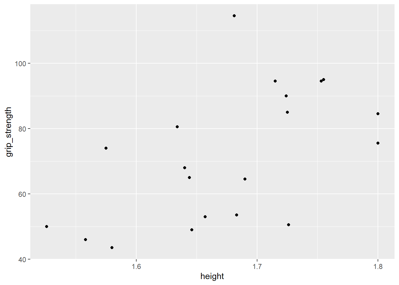 As we said earlier, the plot can be generated with only two lines of code but it is far from ready to be submitted for publication. Putting aside the somewhat sparse data set that we are using, there are many options we can change to tidy up the plot.
#creating a scatter chart
ggplot(data = db, aes(x = height, y = grip_strength)) + #the main plot code
geom_point(shape = 16, #sets the shape type
size = 2, #sets the size of the circles
colour = "#2e6f8e") + #sets the circle colour to the hex colour FFBF00
geom_smooth(method = lm, #adds a linear line to the plot
colour = "#000000", #colours the linear line
se=FALSE) + #adds or removes the se for the linear line
labs(title = "A plot of height versus grip strength", #adds a title to the plot
y = "Grip strength (kg)", #adds a y axis title
x = "Height (m)") + #adds a x axis title
ylim(0,120) + #sets the y axis limit
xlim(1.5,1.9) #sets the x axis limit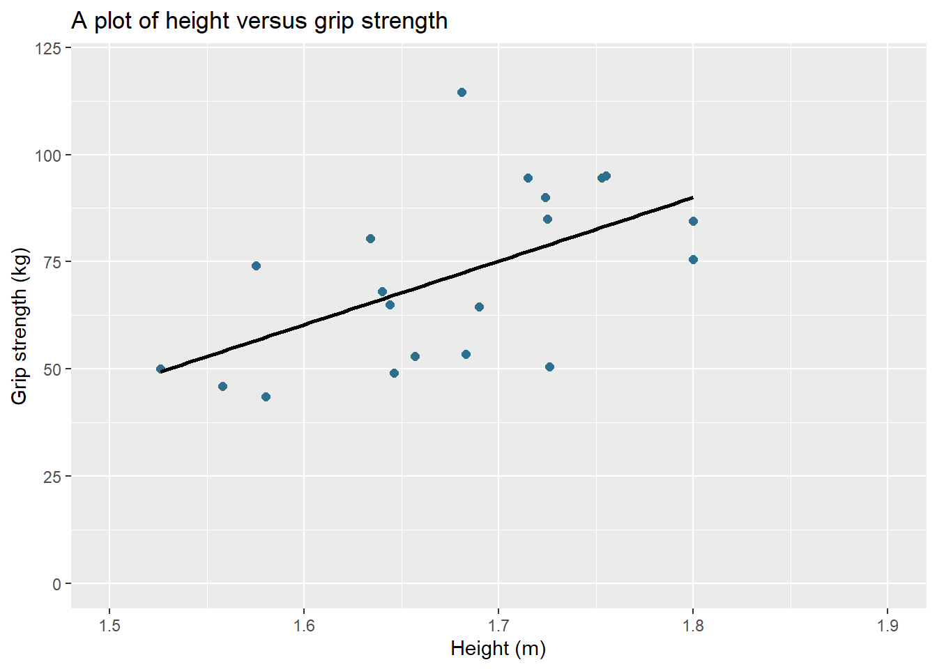
Hopefully you agree that the plot looks much better than the base plot in ggplot2 but there are a few more styling options that we can tweak to make it fully finished.
#reusing some of the code from above
p1 <- ggplot(data = db, aes(x = height, y = grip_strength)) +
geom_point(shape = 16, size = 2, colour = "#29af7f") +
geom_smooth(method = lm, colour = "#000000", se=FALSE) +
labs(title = "A plot of height versus grip strength", #changes the plot title
y = "Grip strength (kg)", #changes the y axis title
x = "Height (m)") + #changes the x axis title
scale_y_continuous(limits = c(0, 120), breaks = seq(0, 120, 20)) + #sets the y axis limit and tick sequence
scale_x_continuous(limits = c(1.5, 1.9), breaks = c(1.5,1.6,1.7,1.8,1.9)) + #sets the x axis limit and tick sequence
coord_cartesian(expand = c(0, 0)) + #plots add space on the edges of the axes and to remove them you can use this code
theme(plot.title = element_text(hjust = 0.5), #justifies the plot title to the centre
axis.line = element_line(), #adds axis lines
panel.background = element_blank()) #removes the plot grey background
p1 #we have assigned the ggplot to the object p1 to use later on in the tutorial and calling p1 displays the plot within the viewer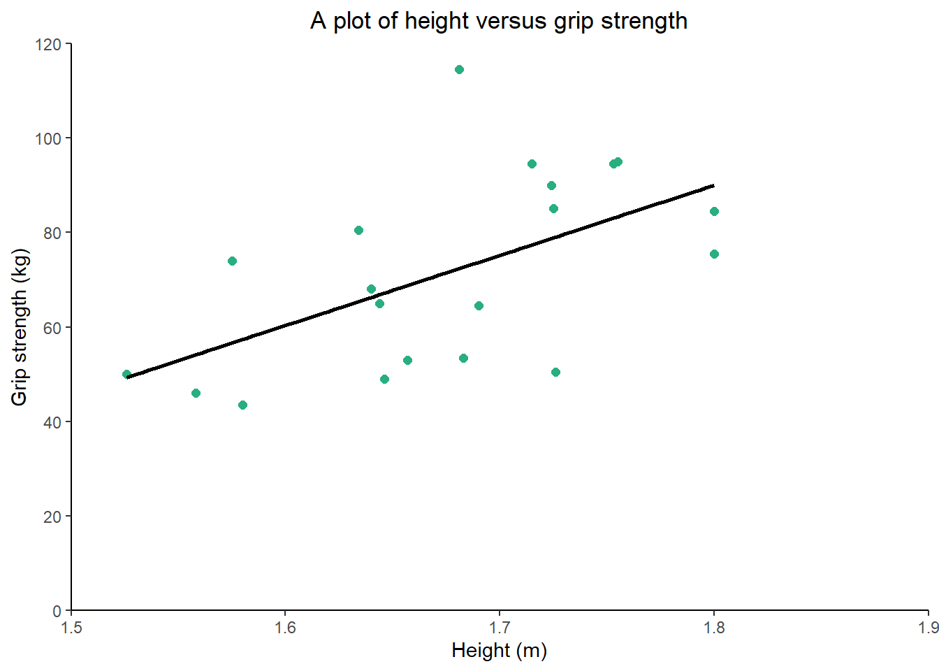
The last two lines of code are preference but the output is clean and understandable. The ggplot2 package is very customisable and one post alone won’t do it justice… there are literally books written just about the package. But by using the above code, you will be able to start to produce plots that can be used for a variety of purposes, included submitted articles.
You will notice in the above example we use the theme() command to set a number of aesthetic options for the plot. There are approximately 100 options within the theme function which can be found here. If there is anything you would like to change aesthetically this is a good place to start!
In the previous example we have only covered the scatter plot, but we will now show you how to create two other types of figures, a bar chart and a line graph. The first chart will aim to visually investigate if the average grip strength is different between those younger than 65 and those 65 or above. There is a little bit of code that is required to make a new grouping variable, but this can always be completed before the graphing process.
#creating a bar chart
#db <- read.csv("HStack_data_bar.csv", header = TRUE)
#remove the # if you haven't already loaded the data
#this is the dataset we will be using within this tutorial
#you will need to change the file path to point to the data file on your machine
library(dplyr)
#required to use the pipes and to calculate group averages
db_bar <- db %>% #assigns the results of the code to the dataframe db_bar
mutate(Above65 = ifelse(age >= 65 ,1,0)) %>% #calculate obese binary variable
group_by(Above65) %>% #group by the sex variable
summarise(grip_mean = mean(grip_strength), grip_sd = sd(grip_strength)) %>% #calculate the mean of the SBP variable
ungroup() #ungroup the variables (always wise to otherwise can causes errors)
p2 <- ggplot(data = db_bar, aes(x = as.factor(Above65), y = grip_mean, #the main plot code and the as.factor tells r to treat Above65 as a grouping variable
fill = as.factor(Above65))) + #tells r to fill per the grouping variable
geom_bar(stat = "identity", #sets the type of bar chart to use the values in the data
width = 0.8) + #changes the fill colour
labs(title = "A plot of age versus grip strength", #changes the plot title
y = "Grip strength (kg)", #changes the y axis title
x = "Age category (1>=65years of age)") + #changes the x axis title
scale_y_continuous(limits = c(0, 140), #sets the y axis limit
breaks = seq(0, 140, 20), #sets the y axis tick intervals
expand = c(0,0)) + #ensures the bars start from the x axis instead of floating
theme(plot.title = element_text(hjust = 0.5), #justifies the plot title to the centre
axis.line = element_line(), #adds axis lines
panel.background = element_blank(), #removes the plot grey background
legend.title = element_blank()) + #removes the legend title
scale_fill_manual(labels = c("Below 65", "Above 65"), #changes the grouping labels for the legend
values = c("0" = "#FDE725FF",
"1" = "#440154FF")) + #manually changes the colours of the bars
geom_errorbar(aes(x=as.factor(Above65), ymin=grip_mean-grip_sd, ymax=grip_mean+grip_sd), width=0.2, colour="black", alpha=1, size=0.5) #adds error bars by using the summary variables from the previous summarise() calculation
p2 #we have assigned the ggplot to the object p2 to use later on in the tutorial and calling p1 displays the plot within the viewer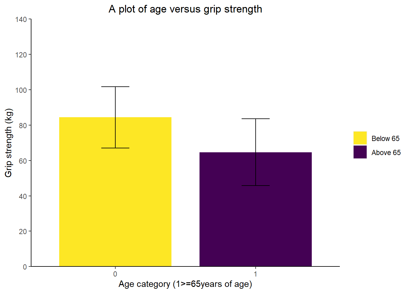
The next example we wanted to show you is a line chart which can be useful for time series analysis or showing changes to a group over time. For this example, we will be using data from the iglu package which stores example glucose monitoring data as examples. This topic is covered in greater detail in the working with glucose data post if you are interested in this type of data.
In this example, we will plot a line chart using time series data and then again the same code to update the formatting.
#creating a line chart
library(iglu)
library(ggplot2)
#load the necessary packages for the example - remember to install the package if you don't already have it using install.packages("iglu")
db_line <- example_data_1_subject %>% #assigning the example data 1 to the object db_line
filter(time >= as.Date("2015-06-14"), time < as.Date("2015-06-16")) #filter to 2 days worth of data
ggplot(aes(x = time, y = gl), data = db_line) + #the main plot code
geom_line(size = 0.75, #changes the line size
colour = "#29af7f") + #changes the line colour
labs(title = "Glucose values over two days", #changes the plot title
y = "Glucose (mg/dl)", #changes the y axis title
x = "Date & time") + #changes the x axis title
scale_y_continuous(limits = c(0, 260), breaks = seq(0, 260, 20)) + #sets the y axis limit and tick sequence
scale_x_datetime(date_breaks = "3 hour", date_labels = ("%d/%m - %H:%M"), expand=c(0,0)) + #sets the x axis labels to every 3 hours and then formats the text to day/month hour:minute
coord_cartesian(expand = c(0, 0)) + #plots add space on the edges of the axes and to remove them you can use this code
geom_hline(yintercept = 70) + #adds a horizontal line for time in range y = 70 mg/dl
geom_hline(yintercept = 180) + #adds a horizontal line for time in range y = 180 mg/dl
theme(axis.text.x = element_text(angle = 40, vjust = 1.0, hjust = 1.0)) + #rotates the x axis labels for readability
theme(plot.title = element_text(hjust = 0.5), #justifies the plot title to the centre
axis.line = element_line(), #adds axis lines
panel.background = element_blank()) #removes the plot grey background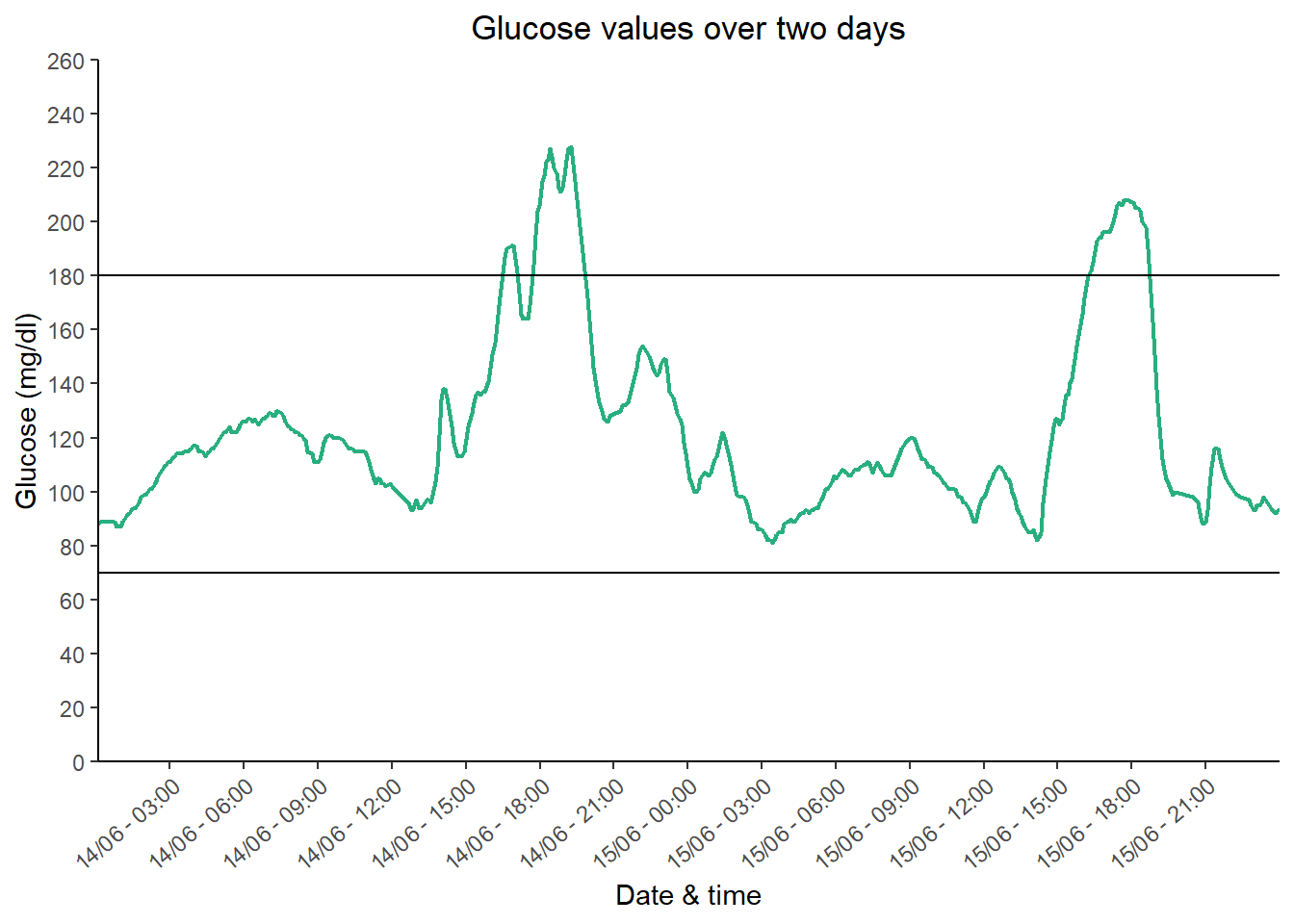 We have shown you how to generate a few graphing types using some simple data. Graphing may be a little tricky with your own data but use our examples and the annotated code to help you.
Other aspects of visualization you should take into account are:
- Shape type here: you can alter the shape type of the data point within ggplot2. Here is a good link to describe how: https://ggplot2.tidyverse.org/reference/aes_linetype_size_shape.html
- You can choose whatever colours you would like for your plot and you can choose them using this handy tool: https://www.color-hex.com/
- When choosing colours, be mindful of journal requirements i.e. can you publish in colour and if not, are the colours distinguishable in greyscale? Also, be mindful of choosing colours that won’t be hard for individuals with colour blindness to interpret.
- We have included most of the aspects you may want to use when plotting but you can rearrange or delete or add as you see fit.
Panel plots
Sometimes representing plots separately can be an inefficient use of space or figure quotas within your journal article. For this purpose, panel plots may be useful and we will quickly show you how to do this now, using some of the code from above. If you haven’t already completed the first parts of the tutorials, you need to complete these first before we continue.
#creating a panel plot (using p1 + p2 from above - ensure these are obejects in your environment)
library(ggpubr)
#we require the ggpubr package for this post - remember to install it using install.packages("ggpubr")
p1 <- p1 + labs(title = "A") + #changes the title from the plot to A for the panel plot
theme(plot.title = element_text(hjust = 0, #ensures the title is left aligned
vjust = 3)) #raises the title a little away from the x yaxis
p2 <- p2 + labs(title = "B") + #changes the title from the plot to A for the panel plot
theme(plot.title = element_text(hjust = 0, #ensures the title is left aligned
vjust = 3)) #raises the title a little away from the x yaxis
panel <- ggarrange(p1 + p2, #insert all of the plots you would like to include in the panel plot
nrow = 1) #sets the number of rows you would like, you can also use ncol = 2 to set the number of coloumns for the plot
panel #calls the completed panel plot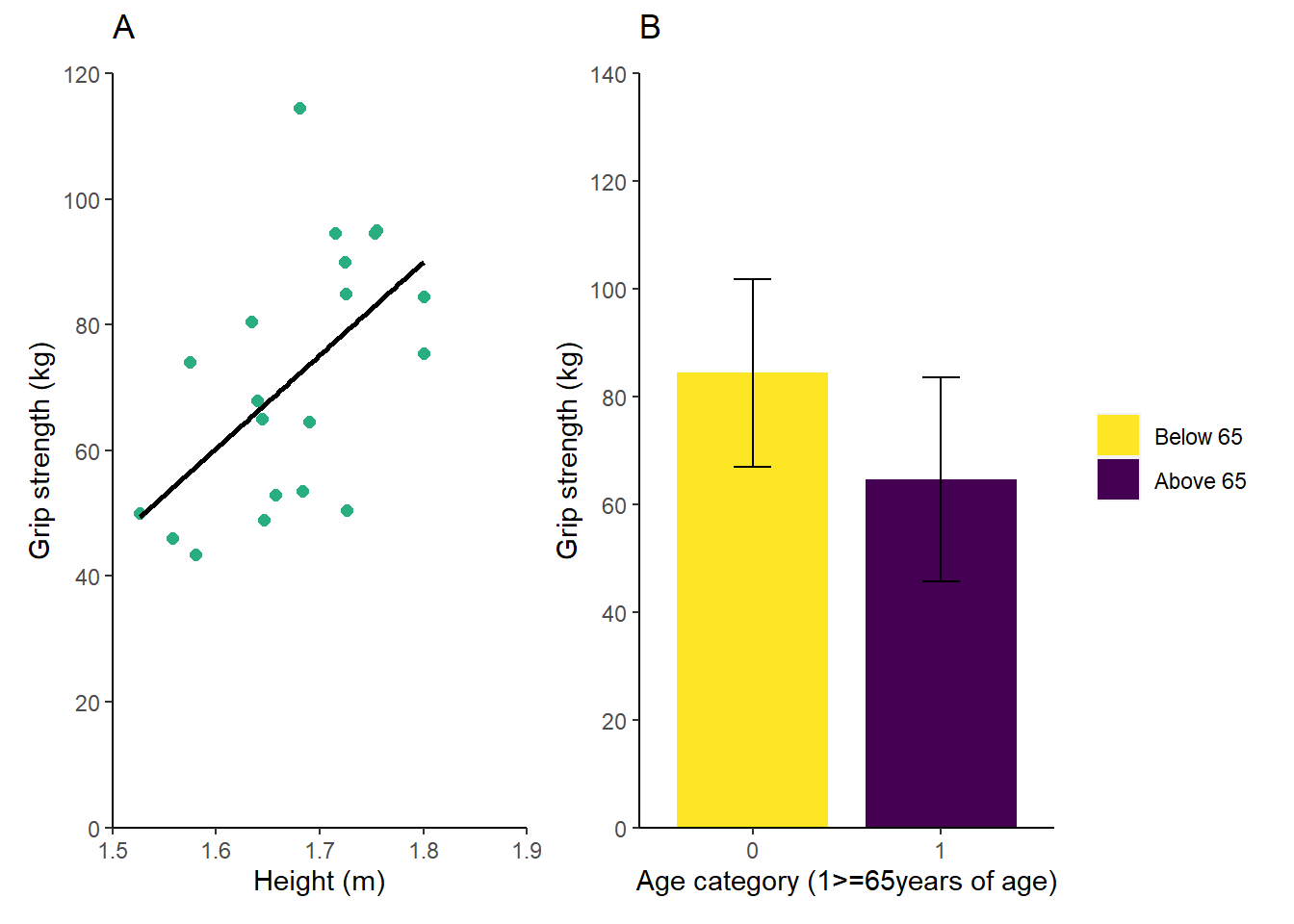 Using a small bit of code saves you the hassle or arranging your plots in Word/PowerPoint and then having to group the added A and B labels. There are other options you can include using ggpubr and you can see them here: https://rpkgs.datanovia.com/ggpubr/reference/ggarrange.html
export and dpi
The final aspect of this tutorial is to show you how to export your plots to be used elsewhere. This task is covered in a future post exporting items from R post but we will quickly include the code below so you can complete the tutorial.
#exporting the panel plot
ggsave("panel_plot.jpeg", #the file name needs to be stated after the opening bracket and you can choose to save as a eps, pdf, jpeg, png etc by changing the suffix
plot = panel, #this command saves the last plot by default but if you have assigned the plot to an object, you can specify this here
width = 40, #width, height and units specifies the size of the plot
height = 20,
units = "cm",
dpi = 600) #dpi sets the plot resolution
#you file will save to wherever your working directory is and this should have been set by starting a new projectConclusion
This post has run through how to create a few common graph types within RStudio. We have tried to include all of the options you may want to tweak so you can reuse the code straight away for your own data. Like everything in R, there are extensions to what we have just described and we have included a few links in the above text. But if there is there is something you would like us to cover then please let us know via the contact page.
Complete code
db <- read.csv("HStack_data.csv", header = TRUE)
#this is the dataset we will be using within this tutorial
#you will need to change the file path to point to the data file on your machine
library(ggplot2)
#we require the ggplot2 package for this post - remember to install it using install.packages("ggplot2")
#the next two lines of code define which data to use, what the x and y axes are and then what type of data to plot (scatter = geom_point)
ggplot(data = db, aes(x = height, y = grip_strength)) +
  geom_point()
#creating a scatter chart
ggplot(data = db, aes(x = height, y = grip_strength)) + #the main plot code
  geom_point(shape = 16, #sets the shape type
             size = 2, #sets the size of the circles
             colour = "#2e6f8e") + #sets the circle colour to the hex colour FFBF00
  geom_smooth(method = lm, #adds a linear line to the plot
              colour = "#000000", #colours the linear line
              se=FALSE) + #adds or removes the se for the linear line
  labs(title = "A plot of height versus grip strength", #adds a title to the plot
       y = "Grip strength (kg)", #adds a y axis title
       x = "Height (m)") + #adds a x axis title
  ylim(0,120) + #sets the y axis limit
  xlim(1.5,1.9) #sets the x axis limit
#reusing some of the code from above
p1 <- ggplot(data = db, aes(x = height, y = grip_strength)) +
  geom_point(shape = 16, size = 2, colour = "#29af7f") +
  geom_smooth(method = lm, colour = "#000000", se=FALSE) +
  labs(title = "A plot of height versus grip strength", #changes the plot title
       y = "Grip strength (kg)", #changes the y axis title
       x = "Height (m)") + #changes the x axis title
  scale_y_continuous(limits = c(0, 120), breaks = seq(0, 120, 20)) + #sets the y axis limit and tick sequence
  scale_x_continuous(limits = c(1.5, 1.9), breaks = c(1.5,1.6,1.7,1.8,1.9)) + #sets the x axis limit and tick sequence
  coord_cartesian(expand = c(0, 0)) + #plots add space on the edges of the axes and to remove them you can use this code
  theme(plot.title = element_text(hjust = 0.5), #justifies the plot title to the centre
        axis.line = element_line(), #adds axis lines
        panel.background = element_blank()) #removes the plot grey background

p1 #we have assigned the ggplot to the object p1 to use later on in the tutorial and calling p1 displays the plot within the viewer
#creating a bar chart
#db <- read.csv("HStack_data_bar.csv", header = TRUE)
#remove the # if you haven't already loaded the data
#this is the dataset we will be using within this tutorial
#you will need to change the file path to point to the data file on your machine

library(dplyr)
#required to use the pipes and to calculate group averages

db_bar <- db %>% #assigns the results of the code to the dataframe db_bar
  mutate(Above65 = ifelse(age >= 65 ,1,0)) %>% #calculate obese binary variable
  group_by(Above65) %>% #group by the sex variable
  summarise(grip_mean = mean(grip_strength), grip_sd = sd(grip_strength)) %>% #calculate the mean of the SBP variable
  ungroup() #ungroup the variables (always wise to otherwise can causes errors)

p2 <- ggplot(data = db_bar, aes(x = as.factor(Above65), y = grip_mean, #the main plot code and the as.factor tells r to treat Above65 as a grouping variable
                                fill = as.factor(Above65))) + #tells r to fill per the grouping variable
  geom_bar(stat = "identity", #sets the type of bar chart to use the values in the data
           width = 0.8) + #changes the fill colour
  labs(title = "A plot of age versus grip strength", #changes the plot title
       y = "Grip strength (kg)", #changes the y axis title
       x = "Age category (1>=65years of age)") + #changes the x axis title
  scale_y_continuous(limits = c(0, 140), #sets the y axis limit
                     breaks = seq(0, 140, 20), #sets the y axis tick intervals
                     expand = c(0,0)) + #ensures the bars start from the x axis instead of floating
  theme(plot.title = element_text(hjust = 0.5), #justifies the plot title to the centre
        axis.line = element_line(), #adds axis lines
        panel.background = element_blank(), #removes the plot grey background
        legend.title = element_blank()) + #removes the legend title
  scale_fill_manual(labels = c("Below 65", "Above 65"), #changes the grouping labels for the legend
                    values = c("0" = "#FDE725FF",
                               "1" = "#440154FF")) + #manually changes the colours of the bars
    geom_errorbar(aes(x=as.factor(Above65), ymin=grip_mean-grip_sd, ymax=grip_mean+grip_sd), width=0.2, colour="black", alpha=1, size=0.5) #adds error bars by using the summary variables from the previous summarise() calculation

p2 #we have assigned the ggplot to the object p2 to use later on in the tutorial and calling p1 displays the plot within the viewer
#creating a line chart
library(iglu)
library(ggplot2)
#load the necessary packages for the example - remember to install the package if you don't already have it using install.packages("iglu")
db_line <- example_data_1_subject %>% #assigning the example data 1 to the object db_line
  filter(time >= as.Date("2015-06-14"), time < as.Date("2015-06-16")) #filter to 2 days worth of data

ggplot(aes(x = time, y = gl), data = db_line) + #the main plot code
  geom_line(size = 0.75, #changes the line size
            colour = "#29af7f") + #changes the line colour
  labs(title = "Glucose values over two days", #changes the plot title
       y = "Glucose (mg/dl)", #changes the y axis title
       x = "Date & time") + #changes the x axis title
  scale_y_continuous(limits = c(0, 260), breaks = seq(0, 260, 20)) + #sets the y axis limit and tick sequence
  scale_x_datetime(date_breaks = "3 hour", date_labels = ("%d/%m - %H:%M"), expand=c(0,0)) + #sets the x axis labels to every 3 hours and then formats the text to day/month hour:minute
  coord_cartesian(expand = c(0, 0)) + #plots add space on the edges of the axes and to remove them you can use this code
  geom_hline(yintercept = 70) + #adds a horizontal line for time in range y = 70 mg/dl
  geom_hline(yintercept = 180) + #adds a horizontal line for time in range y = 180 mg/dl
  theme(axis.text.x = element_text(angle = 40, vjust = 1.0, hjust = 1.0)) + #rotates the x axis labels for readability
  theme(plot.title = element_text(hjust = 0.5), #justifies the plot title to the centre
        axis.line = element_line(), #adds axis lines
        panel.background = element_blank()) #removes the plot grey background
#creating a panel plot (using p1 + p2 from above - ensure these are obejects in your environment)
library(ggpubr)
#we require the ggpubr package for this post - remember to install it using install.packages("ggpubr")

p1 <- p1 + labs(title = "A") + #changes the title from the plot to A for the panel plot
  theme(plot.title = element_text(hjust = 0, #ensures the title is left aligned
                                  vjust = 3)) #raises the title a little away from the x yaxis

p2 <- p2 + labs(title = "B") + #changes the title from the plot to A for the panel plot
  theme(plot.title = element_text(hjust = 0, #ensures the title is left aligned
                                  vjust = 3)) #raises the title a little away from the x yaxis

panel <- ggarrange(p1 + p2, #insert all of the plots you would like to include in the panel plot
                   nrow = 1) #sets the number of rows you would like, you can also use ncol = 2 to set the number of coloumns for the plot

panel #calls the completed panel plot
#exporting the panel plot
ggsave("panel_plot.jpeg", #the file name needs to be stated after the opening bracket and you can choose to save as a eps, pdf, jpeg, png etc by changing the suffix
       plot = panel, #this command saves the last plot by default but if you have assigned the plot to an object, you can specify this here
       width = 40, #width, height and units specifies the size of the plot
       height = 20,
       units = "cm",
       dpi = 600) #dpi sets the plot resolution
#you file will save to wherever your working directory is and this should have been set by starting a new project