TL;DR
R provide a number of base functions to create simple graphs as well as additional packages, such as ggplot2, to allow the creation of more complex graphics.
Introduction
Data visualisations are a fantastic method to examine our data as well as present our findings to others. The R programming language has become known for its ability to create a range of beautiful graphics. In this post, we will look to use both the base R plotting functions as well as the most popular graphing package in R, ggplot2. We will plot some histograms, bar charts and line charts using both methodologies.
Your first graph
For the examples in this post, we will use the National Early Warning Scores (NEWS) data from the NHS-R datasets package. We will library the package and then use the head function to preview the dataset.
For more information on the NHSRdatasets package, please check back to the creating variables post.
library(NHSRdatasets)
#the dataset we are going to be using
head(synthetic_news_data)
## male age NEWS syst dias temp pulse resp sat sup alert died
## 1 0 68 3 150 98 36.8 78 26 96 0 0 0
## 2 1 94 1 145 67 35.0 62 18 96 0 0 0
## 3 0 85 0 169 69 36.2 54 18 96 0 0 0
## 4 1 44 0 154 106 36.9 80 17 96 0 0 0
## 5 0 77 1 122 67 36.4 62 20 95 0 0 0
## 6 0 58 1 146 106 35.3 73 20 98 0 0 0Now we have our data, lets create our first graph. A key question we may have is what is the distribution of participants age within the dataset. To do this, we could use a histogram.
#the hist function is built into R and creates a basic histogram
hist(synthetic_news_data$age) 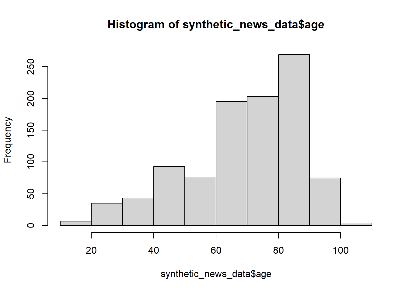
Figure 1: A histogram showing the distribution of age created using base R
There! It can really be that simple! The hist function takes a single column as an argument and from this produces a histogram. You can see we use the synthetic_news_data and we use the $ operator to specify a single column (age) within this dataset. We can already work out a lot from this graph, the right skewed nature of age (more older individuals than younger) as well as a wide spread of age in the dataset from less than 20 to over 100 years.
Now we have plotted a histogram, lets look at how to plot a basic bar chart using base R. To create a bar plot, we will use the barplot function from base R. Before doing so, we need to do a little data manipulation. We will look to plot the number of participants that received each score in the NEWS (National Early Warning Score) variable. We can use the table function to count the number of participant assigned each score. We provide this function with the column we are looking to count. We then put this variable into the barplot function.
#the table function builds a contingency table with counts of each combination in the data
#barplot creates a basic bar chart of our count data
count <- table(synthetic_news_data$NEWS)
barplot(count) 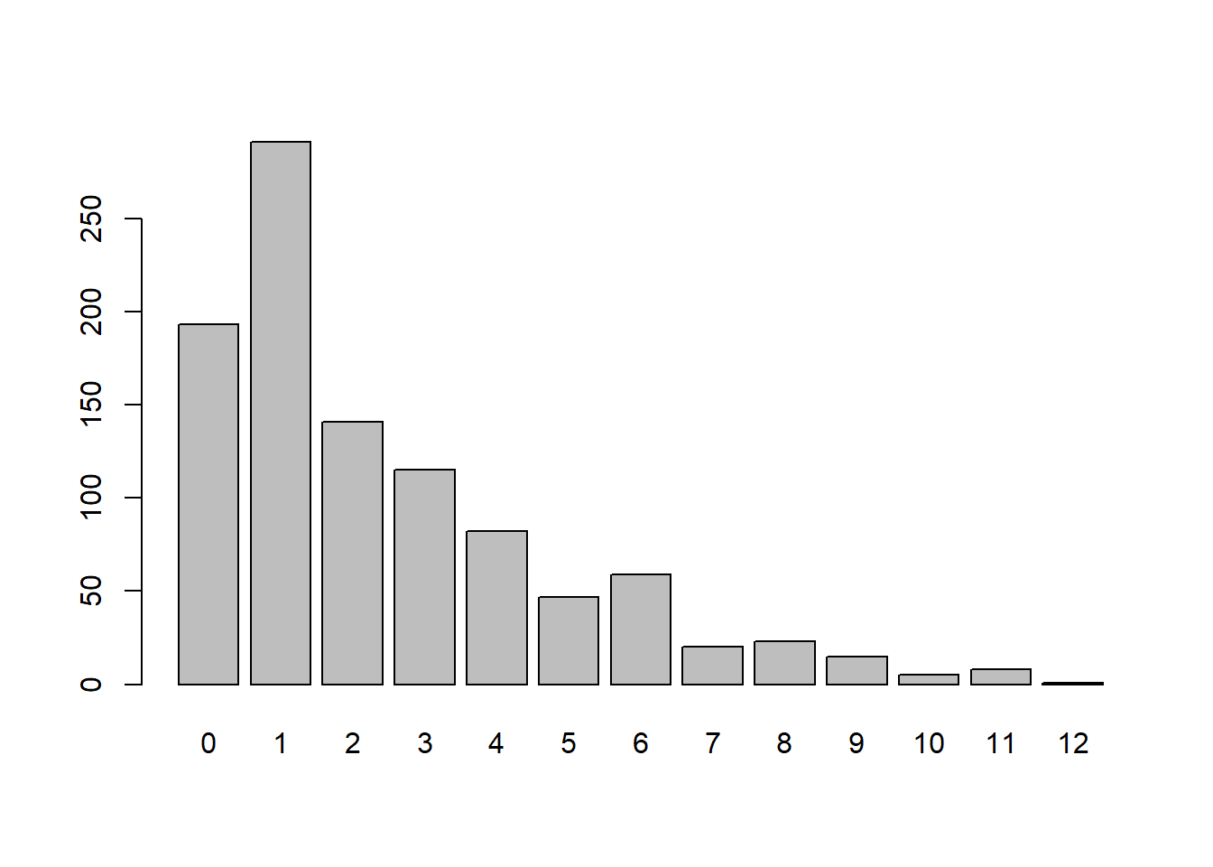
We can clearly see that the most common score in the dataset is 2 with scores decreasing as the score increases with a few fluctuations. Basic bar charts like this are very useful to explore any categorical variables.
Lets explore scatter plots using the base R function plots. This functions takes two arguments, an X followed by a Y axis variable to plot. For this example, we will plot systolic blood pressure (syst) on the X axis and diastolic blood pressure (dias) on the Y axis. For this plot, we do not need to perform any data manipulation prior to plotting the variables so we will just enter them into function as arguments.
#plot creates a basic scatter plot of two continuous variables
plot(synthetic_news_data$syst, synthetic_news_data$dias) 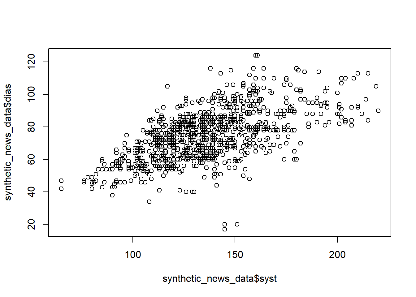
The graph produced is highlights the positive relationship between the two variables.
Extending base R graphs
Whilst the plots above are useful, we can (hopefully!) all see there are many issues that they present. Firstly, they are extremely visually unappealing! Secondly, there are also issues when it comes to lacks of graph titles and axis labels. Luckily, many of these problems can be solved by adding extra arguments to the graphs. Let’s use the final graph as an example.
#visually updating the graphs
#we separate these arguments onto different lines to aid reading
plot(synthetic_news_data$syst, synthetic_news_data$dias,
     main = "Relationship between systolic blood pressure and diastolic blood pressure",
     xlab = "Systolic blood pressure (mmHg)",
     ylab = "Diastolic blood pressure (mmHg)",
col = "darkblue") 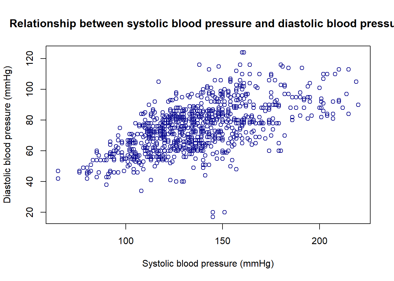
Figure 2: Bar plot with additional arguments to control appearance
I think this plot is a slight improvement, and I emphasise the word slight! You can see we use the argument main to specify the graph title, then the xlab and ylab arguments to create the x axis and y axis labels respectively and then use the col argument to specify the colour of points.
ggplot2
Whilst the above plots are useful, I do not find them visually appealing! They strike me as highly useful for diagnostic purposes and quickly understanding a new dataset, however I would not want to present such visualisations to colleagues or collaborators. Rather than using base R to generate such graphics, we could use the plotting package ggplot2. This package is part of the tidyverse series of packages and is the most widely used data visualisation package in the R community. This wide use, combined with the consistent syntax across many graph types, makes ggplot2 our recommendation for plotting in R.
As mentioned above, ggplot2 follows a consistent syntax when creating graphs. The basic structure of this is outlined below.
ggplot(data = data, aes(x = x, y = y)) +
  geom_(graph_type)
#this is the basic ggplot2 syntax
Hopefully this syntax is not to scary! We start by using the ggplot function and pass into it a data argument (usually a dataframe containing the columns you want to plot). We then use the aes (short for aesthetics) function where we can specify which variables to put on the X and/or Y axis of the plot. We then use the + symbol (similar to the pipe function from the magrittr package) to add geoms to our plot. These specify which sort of graph we want to be plotted.
Now we understand the basic syntax, lets create a basic histogram using ggplot2. We will use the age variable from the synthetic_news_data dataframe again.
#using ggplot to generate the graph
library(ggplot2)
ggplot(data = synthetic_news_data, aes(x = age)) +
  geom_histogram()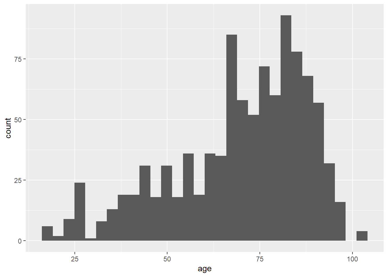
#this applies colours to our graph that can help those with colour blindness discern the variables
ggplot(synthetic_news_data, aes(age, fill = as.factor(male))) +
  geom_histogram(binwidth = 10) +
scale_fill_viridis_d() 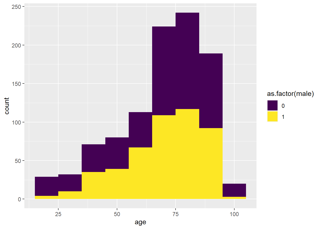
Figure 3: A histogram of age separated by sex created using ggplot2
From this graph, we can see that generally the distributions are the same but there are fewer male participants than female at all ages. You may notice that I have added an extra line of code to this graph: scale_fill_viridis_d. This is a function that control the fill of the graph (the colour of the bars). In our example, we apply the viridis colour palette. This palette can be seen well by visually impaired individuals however many other colour schemes are available for you to choose from. the "_d" signifies we want the discrete colour palette (separate colours) rather than the continuous colour palette for continuous variables.
Now we have made our first ggplot2 graph, let’s make another.
#generates another graph within ggplot using the same data
ggplot(data = synthetic_news_data, aes(x = NEWS, fill = as.factor(NEWS))) +
  geom_bar() +
  scale_fill_viridis_d()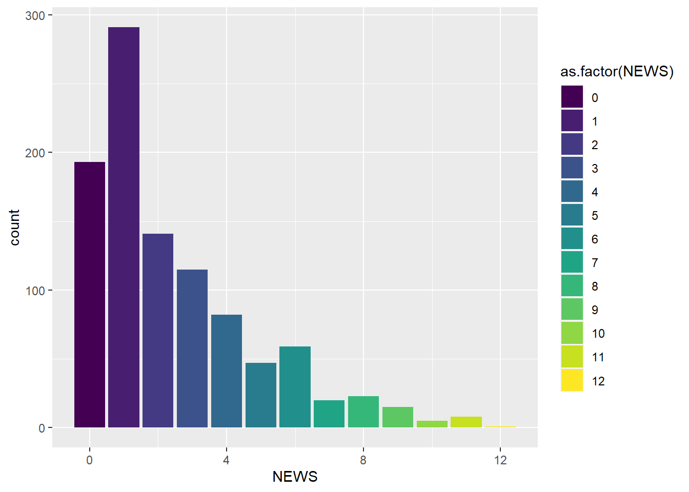
Figure 4: A bar chart created by ggplot2
Here we go, we now have a colour coded bar chart showing the number of participants who received each NEWS value. We used the viridis colour palette to colour the graph once again. Now lets take a look at the scatter plot from earlier.
#creating a scatter plot using ggplot
#the geom_hline and geom_vline functions create a horizontal and vertical line
#these lines are at 120 and 80 (the generally accepted threshold for high blood pressure)
#the transparency of these lines was also set to 40% (alpha = 0.4) so they do not over power the graph
ggplot(data = synthetic_news_data, aes(x = syst, y = dias, color = as.factor(male))) +
  geom_point() +
  geom_vline(aes(xintercept = 120, alpha = 0.4)) +
  geom_hline(aes(yintercept = 80, alpha = 0.4))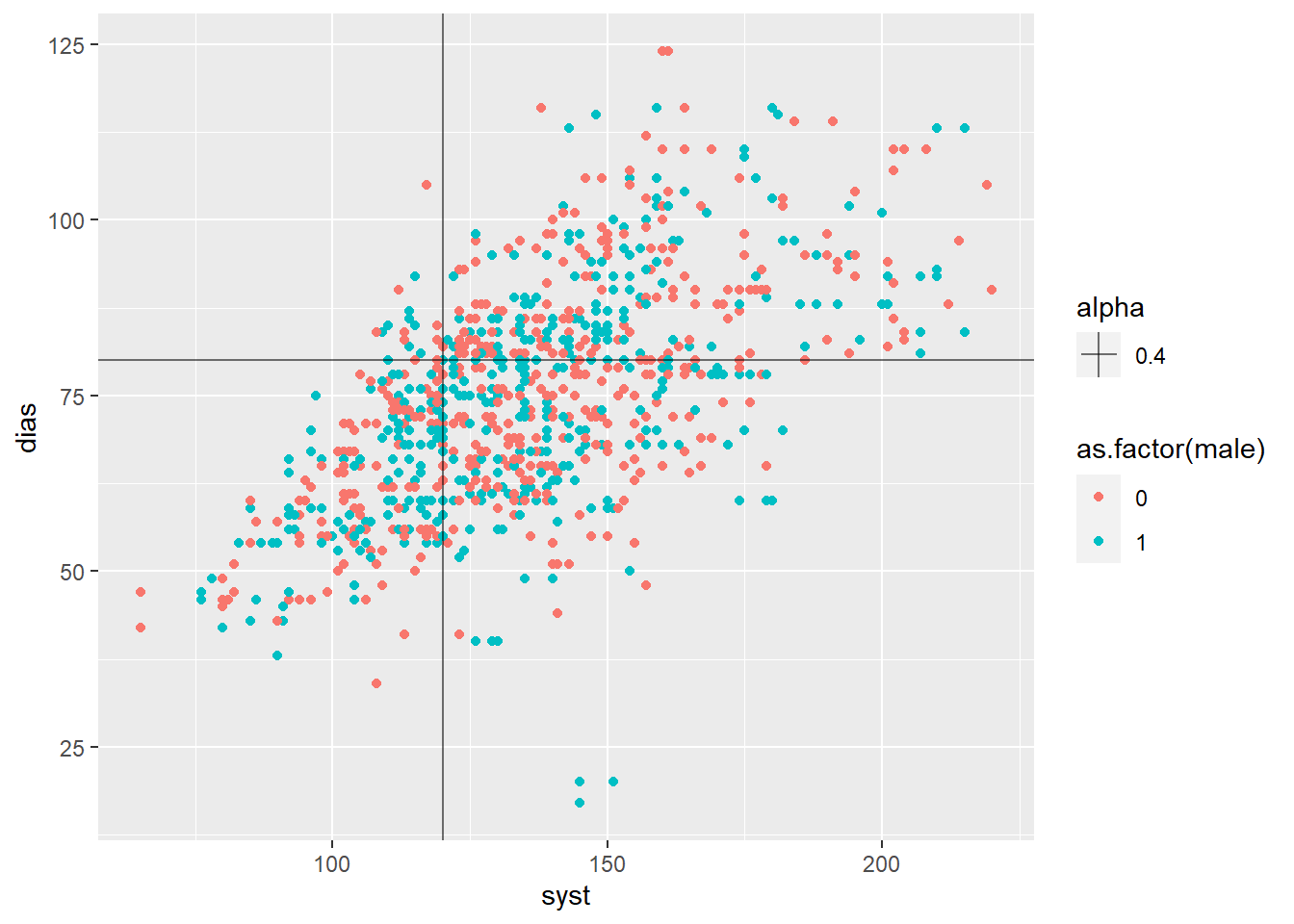
Figure 5: ggplot2 scatter plot
As we can see, we can create a relatively complex graph with only a few simple lines of code! We start by creating the plot as we have before and setting the x, y and fill characteristics of the graph. We then specify geom_point as we want a scatter plot. Next, we use the geom_hline and geom_vline functions to create a horizontal and vertical line respectively. I put these lines at 120 and 80 (the generally accepted threshold for high blood pressure). I also set the transparency of these lines to 40% (alpha = 0.4) so they do not over power the graph.
Multiple plots in ggplot2
Another key benefit of ggplot2 over base R is the ability to combine graphs together. This can include something known as faceting, splitting a single graph into two based on a variable in the dataset or combining two graph types on the same set of axes.
Let’s first look at faceting.
#how to split the graph based on a grouping variable
ggplot(data = synthetic_news_data, aes(x = syst, y = dias)) +
  geom_point() +
  facet_wrap(~male)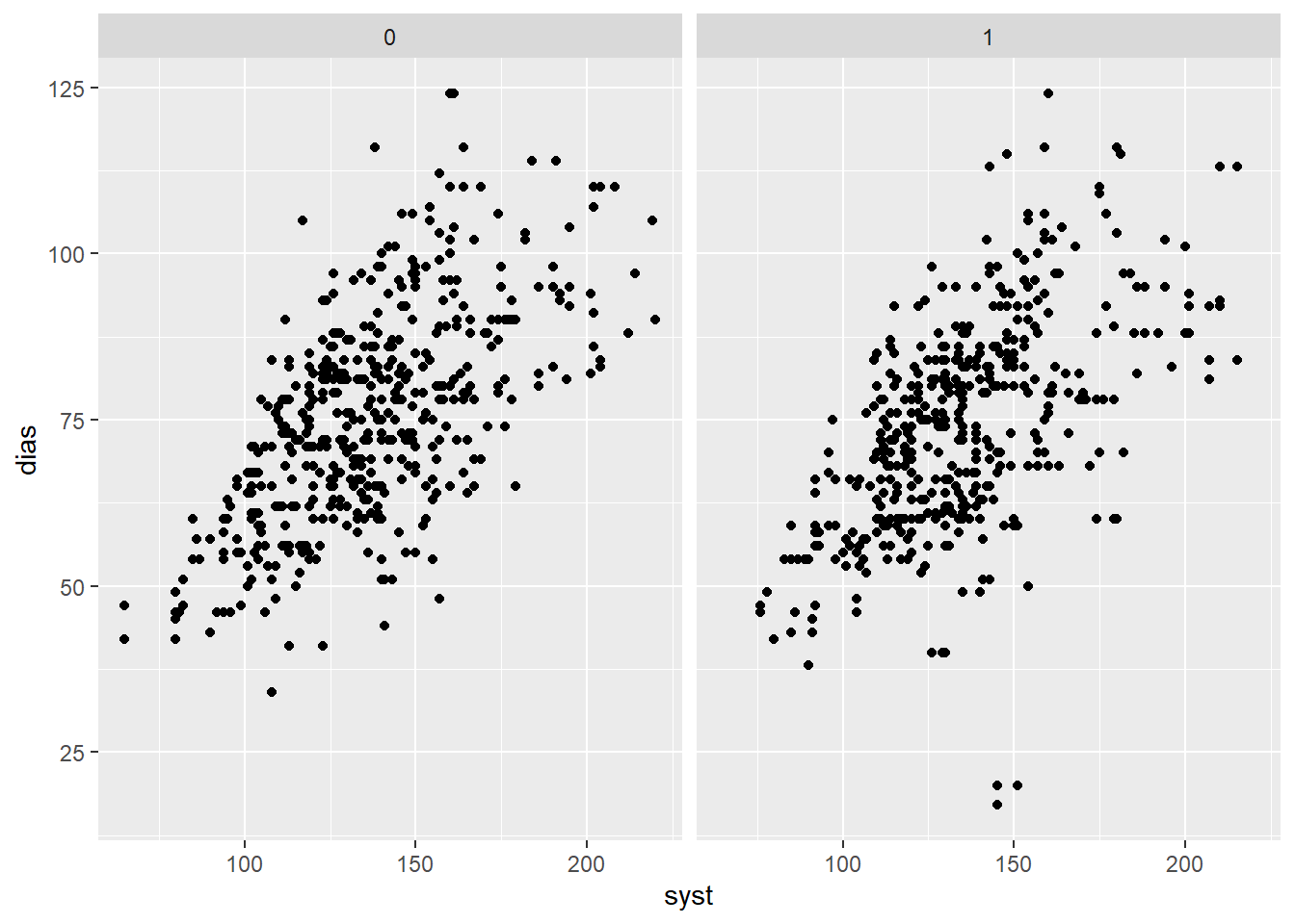
Figure 6: A ggplot2 scatter graph that has been faceted
And again, it really is that simple! We have now split our blood pressure graph to look at male and female participants separately. This was achieved by using the facet_wrap command and providing it the variable (in this case sex) to facet the plot by. This function is also incredibly useful when looking at data across time, or any other form of categorical variable for that matter.
Base or ggplot2?
In short, the answer is ggplot2! Its ease of use, combined with its greater adjustability and most importantly, the fact it utilises the same syntax for all graph types regardless of their complexity makes it an obvious choice for all R users. However, it is not quite that simple! Base R functions are useful especially when you want to examine your data quickly and get a rough idea of what is going on.
Conclusions
R is a fantastic tool for visualising data using both the base R plotting functions as well as the ggplot2 package offer a fantastic range of options. In future blog posts, we may cover more advanced plotting techniques including time series, geo-spatial and systems data.
Future reading?
There are a vast number of resources to aid in learning data visualisation in R. A few of our favourites are listed below:
The book ggplot2: Elegant Graphics for Data Analysis written by Hadley Wickham gives a detailed look at all things ggplot2
The book R for Data Science again by Hadley Wickham gives a great summary of all things data science in R including an introductory chapter to ggplot2
The book Data Visualisation by Andy Kirk gives a fantastic overview of all things data visualisation but does not specific reference any tools so this information can be transferred to any data visualisation tool you choose to use
The book Better Data Visualisations by Jonathan Schwabish is similar to the above book and gives general data visualisation principles rather than specific ggplot2 advice. However, it does this superbly well and in a non-technical way allows readers to understand how to think about and in future create more effective data visualisations.
Complete code
library(NHSRdatasets)
#the dataset we are going to be using
head(synthetic_news_data)

hist(synthetic_news_data$age)
#the hist function is built into R and creates a basic histogram

count <- table(synthetic_news_data$NEWS)
barplot(count)
#the table function builds a contingency table with counts of each combination in the data
#barplot creates a basic bar chart of our count data

plot(synthetic_news_data$syst, synthetic_news_data$dias)
#plot creates a basic scatter plot of two continuous variables

plot(synthetic_news_data$syst, synthetic_news_data$dias,
     main = "Relationship between systolic blood pressure and diastolic blood pressure",
     xlab = "Systolic blood pressure (mmHg)",
     ylab = "Diastolic blood pressure (mmHg)",
     col = "darkblue")
#visually updating the graphs
#we separate these arguments onto different lines to aid reading

ggplot(data = data, aes(x = x, y = y)) +
  geom_(graph_type)
#this is the basic ggplot2 syntax

library(ggplot2)
ggplot(data = synthetic_news_data, aes(x = age)) +
  geom_histogram()
#using ggplot to generate the graph

ggplot(synthetic_news_data, aes(age, fill = as.factor(male))) +
  geom_histogram(binwidth = 10) +
  scale_fill_viridis_d()
#this applies colours to our graph that can help those with colour blindness discern the variables

ggplot(data = synthetic_news_data, aes(x = NEWS, fill = as.factor(NEWS))) +
  geom_bar() +
  scale_fill_viridis_d()
#generates another graph within ggplot using the same data

ggplot(data = synthetic_news_data, aes(x = syst, y = dias, color = as.factor(male))) +
  geom_point() +
  geom_vline(aes(xintercept = 120, alpha = 0.4)) +
  geom_hline(aes(yintercept = 80, alpha = 0.4))
#creating a scatter plot using ggplot
#the geom_hline and geom_vline functions create a horizontal and vertical line
#these lines are at 120 and 80 (the generally accepted threshold for high blood pressure)
#the transparency of these lines was also set to 40% (alpha = 0.4) so they do not over power the graph

ggplot(data = synthetic_news_data, aes(x = syst, y = dias)) +
  geom_point() +
  facet_wrap(~male)
#how to split the graph based on a grouping variable