TL;DR
Correlations are a highly useful statistic to explore relationships within your data. R offers a simple syntax to calculate correlations and a number of packages are available to improve the output of these calculations.
Introduction
Correlations are one of the most basic statistics that can be generated to compare two numeric columns. They are useful to examine the relationship between two metrics and allows us to observe whether a change in one metric coincides with a change in the other. Whilst correlations have several caveats as a statistics (correlation is not causation!), they are incredibly useful as an initial exploratory statistic. In this post, we will look at how to calculate basic correlations and then progress to look at some more realistic use cases.
A simple correlation
Lets begin by calculating a simple correlation between two variables within a dataframe. We will use the synthetic news dataframe from the NHSRdatasets package for this post.
Let’s start by having a look at our dataframe using the head function.
For more information on the NHSRdatasets package, please check back to the creating variables post.
library(NHSRdatasets)
news_data <- synthetic_news_data
#assigning synthetic news data to a dataframe called news_data
#investigate the dataframe using head
head(news_data)
## male age NEWS syst dias temp pulse resp sat sup alert died
## 1 0 68 3 150 98 36.8 78 26 96 0 0 0
## 2 1 94 1 145 67 35.0 62 18 96 0 0 0
## 3 0 85 0 169 69 36.2 54 18 96 0 0 0
## 4 1 44 0 154 106 36.9 80 17 96 0 0 0
## 5 0 77 1 122 67 36.4 62 20 95 0 0 0
## 6 0 58 1 146 106 35.3 73 20 98 0 0 0We can see we have a range of variables, they are all currently set as integer (numeric). However, some are clearly factor variables so we will quickly set these up correctly.
news_data$male <- as.factor(news_data$male)
news_data$NEWS <- as.factor(news_data$NEWS)
news_data$sup <- as.factor(news_data$sup)
news_data$alert <- as.factor(news_data$alert)
news_data$died <- as.factor(news_data$died)
#convert variables from integer to factor variables
#as factor changes the type of data stored in the column but not the values
#head investigates the dataframe
head(news_data)
## male age NEWS syst dias temp pulse resp sat sup alert died
## 1 0 68 3 150 98 36.8 78 26 96 0 0 0
## 2 1 94 1 145 67 35.0 62 18 96 0 0 0
## 3 0 85 0 169 69 36.2 54 18 96 0 0 0
## 4 1 44 0 154 106 36.9 80 17 96 0 0 0
## 5 0 77 1 122 67 36.4 62 20 95 0 0 0
## 6 0 58 1 146 106 35.3 73 20 98 0 0 0There! We can now see that our variables are set up cooreectly. Lets start by examining the correlation between two variables, lets look at systolic blood pressure (syst) and diastolic blood pressure (dias).
#cor is a built in R function to generate a correlation
cor(news_data$syst, news_data$dias)
## [1] 0.5992569And it’s that simple! All we need to supply the cor function is the two columns separated by a comma. By default, the cor function calculates a Pearson’s correlation however, we can specify a different method in the method argument of the function. Below, we specify the Kendall method.
#calculate a correlation using the kendall method
cor(news_data$syst, news_data$dias, method = "kendall")
## [1] 0.4299334We can see that the different methods produce slightly different values. Might need to explain that!!
Whilst the above is useful, we can also examine the correlation between two variables visually using a graph. We use ggplot2 below to create a scatter plot of our data and then use the geom_smooth function to put a line of best fit through our data. We set the method of the geom_smooth to “lm” meaning the line will be linear and then remove the standard error from the plot.
library(ggplot2)
library(magrittr)
library(dplyr)
#examine the correlation between two variables visually using a graph
news_data %>%
  ggplot(aes(x = syst, y = dias)) +
  geom_point() +
  geom_smooth(method = "lm", se = FALSE)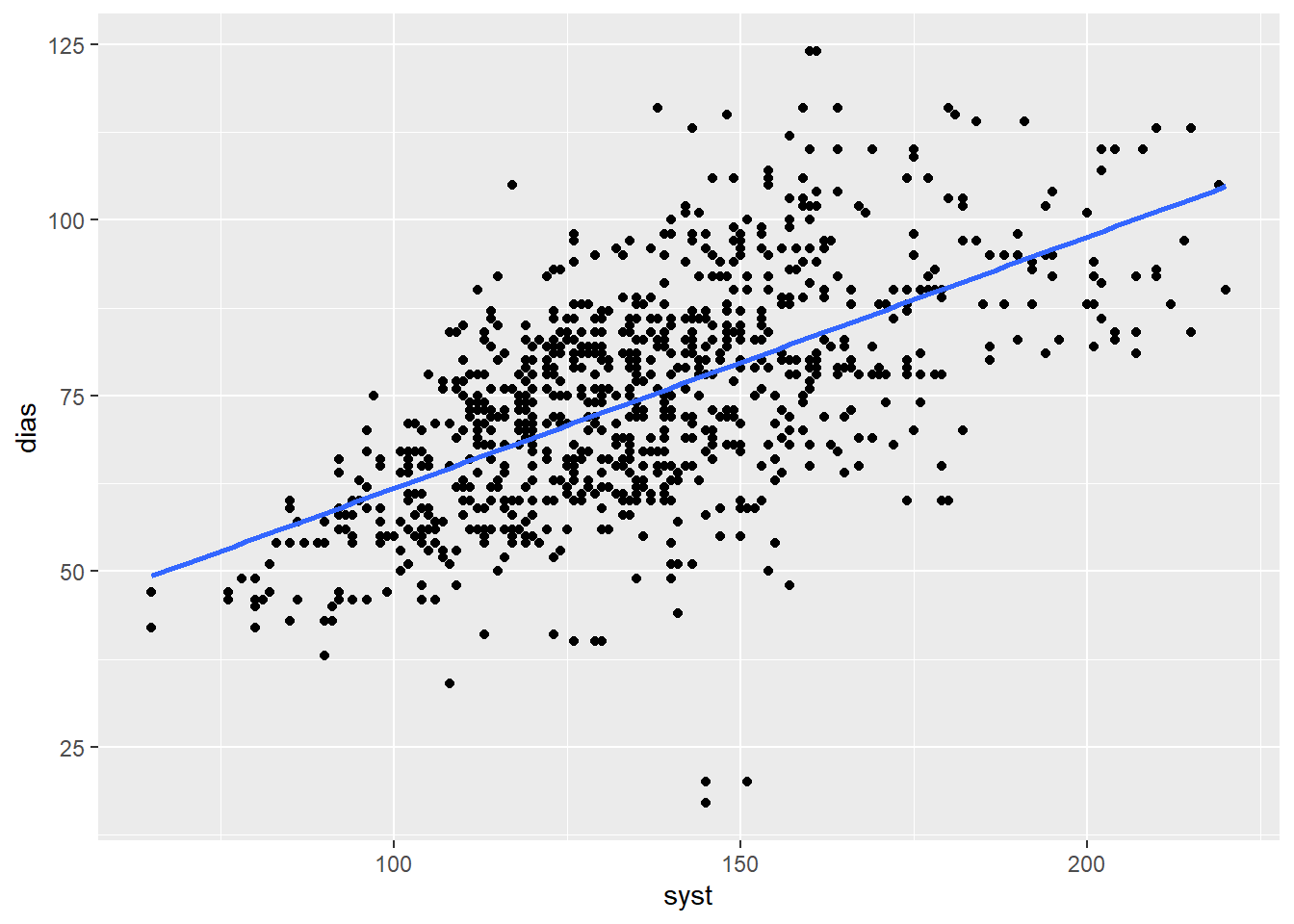
Figure 1: Correlation between systolic and diastolic blood pressure
This visual check is very useful and is always good practice when calculating correlations.
Correlation p-values
While we often look at the r value to determine whether two values are correlated, we can also perform a significance test. This test gives us a P-value which we can use to determine if the variables are statistically significantly correlated. The code below allows us to do this in base R. We use the cor.test function which generates a correlation object. We can then use the $ operator to extract a range of parameters from this object: including the p-value.
correlation <- cor.test(news_data$syst, news_data$dias) # using the base R cor.test function
correlation$p.value # using the $ operator to get the p-value from the list
## [1] 1.618988e-98Multiple correlations
Whilst the above is useful, what if we want to know the correlation between all variables in our dataset? The code below allows us to do that.
#examine the correlation between all variables in the dataset
#the where function tells select to look across all columns for the condition specified within it
news_data %>%
  select(where(is.numeric)) %>%
  cor()
## age syst dias temp pulse
## age 1.000000000 0.148244004 -0.119165429 -0.0519958732 -0.005109752
## syst 0.148244004 1.000000000 0.599256892 0.0039228062 -0.150733371
## dias -0.119165429 0.599256892 1.000000000 -0.0287346006 -0.042963451
## temp -0.051995873 0.003922806 -0.028734601 1.0000000000 0.229100108
## pulse -0.005109752 -0.150733371 -0.042963451 0.2291001075 1.000000000
## resp 0.170941449 -0.024446803 -0.013886878 -0.0004084707 0.296901622
## sat -0.237289766 -0.034747455 0.002651182 -0.1181545716 -0.216306805
## resp sat
## age 0.1709414489 -0.237289766
## syst -0.0244468029 -0.034747455
## dias -0.0138868782 0.002651182
## temp -0.0004084707 -0.118154572
## pulse 0.2969016219 -0.216306805
## resp 1.0000000000 -0.222280786
## sat -0.2222807860 1.000000000This is my preferred way to calculate multiple correlations within a dataframe. It uses the select function from dplyr alongside the tidyselect helper function where and within this where function we use the base R function is.numeric. This line of code only returns columns that are numeric and therefore a correlation can be calculated. We then use the pipe operator to supply this to the cor function to generate a correlation matrix.
We can see from the output we have now generated a standard correlation matrix where there is a line of perfect correlations (1) between the same variables stretching diagonally across the matrix. We can then see all the values above the diagonal line of perfect correlations is a mirror of the values below this line. However, the output is not particularly easy to read. The excessive number of decimal places alongside the monochrome colouring makes identifying any trends or patterns difficult.
P-values from multiple correlations
We can also get P-values from multiple correlations at the same time. To do this, we will use the rcorr package from the Hmisc package. We provide this function our dataframe converted to a matrix (using the as.matrix function).
#as.matrix creates a matrix from the dataframe which is run through the rcorr function
library(Hmisc)
rcorr(as.matrix(news_data))
## male age NEWS syst dias temp pulse resp sat sup alert died
## male 1.00 0.03 -0.01 -0.01 -0.03 -0.04 -0.04 0.00 0.01 0.04 0.06 0.01
## age 0.03 1.00 0.18 0.15 -0.12 -0.05 -0.01 0.17 -0.24 0.09 0.07 0.15
## NEWS -0.01 0.18 1.00 -0.24 -0.16 -0.08 0.45 0.62 -0.37 0.54 0.34 0.22
## syst -0.01 0.15 -0.24 1.00 0.60 0.00 -0.15 -0.02 -0.03 -0.12 -0.01 0.00
## dias -0.03 -0.12 -0.16 0.60 1.00 -0.03 -0.04 -0.01 0.00 -0.05 -0.04 -0.08
## temp -0.04 -0.05 -0.08 0.00 -0.03 1.00 0.23 0.00 -0.12 0.05 -0.02 -0.05
## pulse -0.04 -0.01 0.45 -0.15 -0.04 0.23 1.00 0.30 -0.22 0.13 0.08 0.10
## resp 0.00 0.17 0.62 -0.02 -0.01 0.00 0.30 1.00 -0.22 0.30 0.07 0.11
## sat 0.01 -0.24 -0.37 -0.03 0.00 -0.12 -0.22 -0.22 1.00 -0.10 -0.09 -0.04
## sup 0.04 0.09 0.54 -0.12 -0.05 0.05 0.13 0.30 -0.10 1.00 0.29 0.11
## alert 0.06 0.07 0.34 -0.01 -0.04 -0.02 0.08 0.07 -0.09 0.29 1.00 0.19
## died 0.01 0.15 0.22 0.00 -0.08 -0.05 0.10 0.11 -0.04 0.11 0.19 1.00
##
## n= 1000
##
##
## P
## male age NEWS syst dias temp pulse resp sat sup
## male 0.3881 0.8678 0.7952 0.2986 0.1647 0.2269 0.8899 0.7277 0.2139
## age 0.3881 0.0000 0.0000 0.0002 0.1003 0.8718 0.0000 0.0000 0.0029
## NEWS 0.8678 0.0000 0.0000 0.0000 0.0096 0.0000 0.0000 0.0000 0.0000
## syst 0.7952 0.0000 0.0000 0.0000 0.9014 0.0000 0.4400 0.2723 0.0001
## dias 0.2986 0.0002 0.0000 0.0000 0.3640 0.1746 0.6609 0.9333 0.1265
## temp 0.1647 0.1003 0.0096 0.9014 0.3640 0.0000 0.9897 0.0002 0.1228
## pulse 0.2269 0.8718 0.0000 0.0000 0.1746 0.0000 0.0000 0.0000 0.0000
## resp 0.8899 0.0000 0.0000 0.4400 0.6609 0.9897 0.0000 0.0000 0.0000
## sat 0.7277 0.0000 0.0000 0.2723 0.9333 0.0002 0.0000 0.0000 0.0013
## sup 0.2139 0.0029 0.0000 0.0001 0.1265 0.1228 0.0000 0.0000 0.0013
## alert 0.0564 0.0317 0.0000 0.6506 0.2316 0.4678 0.0151 0.0324 0.0045 0.0000
## died 0.6771 0.0000 0.0000 0.9088 0.0175 0.1449 0.0017 0.0004 0.2662 0.0004
## alert died
## male 0.0564 0.6771
## age 0.0317 0.0000
## NEWS 0.0000 0.0000
## syst 0.6506 0.9088
## dias 0.2316 0.0175
## temp 0.4678 0.1449
## pulse 0.0151 0.0017
## resp 0.0324 0.0004
## sat 0.0045 0.2662
## sup 0.0000 0.0004
## alert 0.0000
## died 0.0000We can see this function gives us two dataframes, one with the perfect 1 correlation between matching variables and one where the perfect correlations have been removed. You can see from this matrix that some of our variables have very statistically significant correlations, whilst others do not.
Trying to assess the coefficients and p values within the console can get quite confusing and so using some little tricks from our previous posts, we can save the results as r objects.
#as.matrix creates a matrix from the dataframe which is run through the rcorr function
library(Hmisc)
rcorr <- rcorr(as.matrix(news_data))
#saves the correlation matrix as an object

rcorr.coeff <- rcorr$r %>%
  round(digit = 3)
#this piece of code assigns the coefficients from the rcorr list into its own object
#the round() code makes the numbers easier to interpret by rounding to 3 decimal places

rcorr.p <- rcorr$P %>%
  round(digit = 3)
#this achieves the same result but now for the p values

#displays the p results from the correlations
rcorr.p
## male age NEWS syst dias temp pulse resp sat sup alert died
## male NA 0.388 0.868 0.795 0.299 0.165 0.227 0.890 0.728 0.214 0.056 0.677
## age 0.388 NA 0.000 0.000 0.000 0.100 0.872 0.000 0.000 0.003 0.032 0.000
## NEWS 0.868 0.000 NA 0.000 0.000 0.010 0.000 0.000 0.000 0.000 0.000 0.000
## syst 0.795 0.000 0.000 NA 0.000 0.901 0.000 0.440 0.272 0.000 0.651 0.909
## dias 0.299 0.000 0.000 0.000 NA 0.364 0.175 0.661 0.933 0.126 0.232 0.018
## temp 0.165 0.100 0.010 0.901 0.364 NA 0.000 0.990 0.000 0.123 0.468 0.145
## pulse 0.227 0.872 0.000 0.000 0.175 0.000 NA 0.000 0.000 0.000 0.015 0.002
## resp 0.890 0.000 0.000 0.440 0.661 0.990 0.000 NA 0.000 0.000 0.032 0.000
## sat 0.728 0.000 0.000 0.272 0.933 0.000 0.000 0.000 NA 0.001 0.005 0.266
## sup 0.214 0.003 0.000 0.000 0.126 0.123 0.000 0.000 0.001 NA 0.000 0.000
## alert 0.056 0.032 0.000 0.651 0.232 0.468 0.015 0.032 0.005 0.000 NA 0.000
## died 0.677 0.000 0.000 0.909 0.018 0.145 0.002 0.000 0.266 0.000 0.000 NAFrom the above, you can now view and also export the results from the correlation matrix. This makes the results easier to understand and come back to later, rather than always viewing the results within the console.
The output of correlation
Whilst the above correlation matrix is useful, it is not very attractive to look at. This makes it difficult at a glance to examine which variables are highly correlated and which direction these relationships are in. TO solve this problem, we can format our output using a range of packages. First, we will look at the cable packge, followed by the the corrplot package.
kable
kable is a package that allows use to generate a more attractive looking table in R. In the code below, we use two function (kable and kable_styling) to generate a much more attractive version of our correlation matrix.
library(kableExtra)
#kable is a package that allows use to generate a more attractive looking table in R
#kable gives a basic kable table as an HTML table
news_data %>%
  select(where(is.numeric)) %>%
  cor() %>%
  kable() %>%
kable_styling() | age | syst | dias | temp | pulse | resp | sat | |
|---|---|---|---|---|---|---|---|
| age | 1.0000000 | 0.1482440 | -0.1191654 | -0.0519959 | -0.0051098 | 0.1709414 | -0.2372898 |
| syst | 0.1482440 | 1.0000000 | 0.5992569 | 0.0039228 | -0.1507334 | -0.0244468 | -0.0347475 |
| dias | -0.1191654 | 0.5992569 | 1.0000000 | -0.0287346 | -0.0429635 | -0.0138869 | 0.0026512 |
| temp | -0.0519959 | 0.0039228 | -0.0287346 | 1.0000000 | 0.2291001 | -0.0004085 | -0.1181546 |
| pulse | -0.0051098 | -0.1507334 | -0.0429635 | 0.2291001 | 1.0000000 | 0.2969016 | -0.2163068 |
| resp | 0.1709414 | -0.0244468 | -0.0138869 | -0.0004085 | 0.2969016 | 1.0000000 | -0.2222808 |
| sat | -0.2372898 | -0.0347475 | 0.0026512 | -0.1181546 | -0.2163068 | -0.2222808 | 1.0000000 |
Hopefully you can appreciate that this output is more visually appealing and easier to read than the default output produced by R. However, even this table still requires significant effort to pick out the patterns and trends in the correlation matrix due to the lack of colour to differentiate values. Luckily, there is another package that can help us with this.
corrplot
The corrplot package provides a number of functions that allow us to generate plots of correlation matrices. These plots can be a highly effective method to communicate the overall trends and patterns regarding the correlations in a dataframe. The code below generates a basic correlation plot.
library(corrplot)
#generates a number corrplot
news_data %>%
  select(where(is.numeric)) %>%
  cor() %>%
  corrplot(method = "number")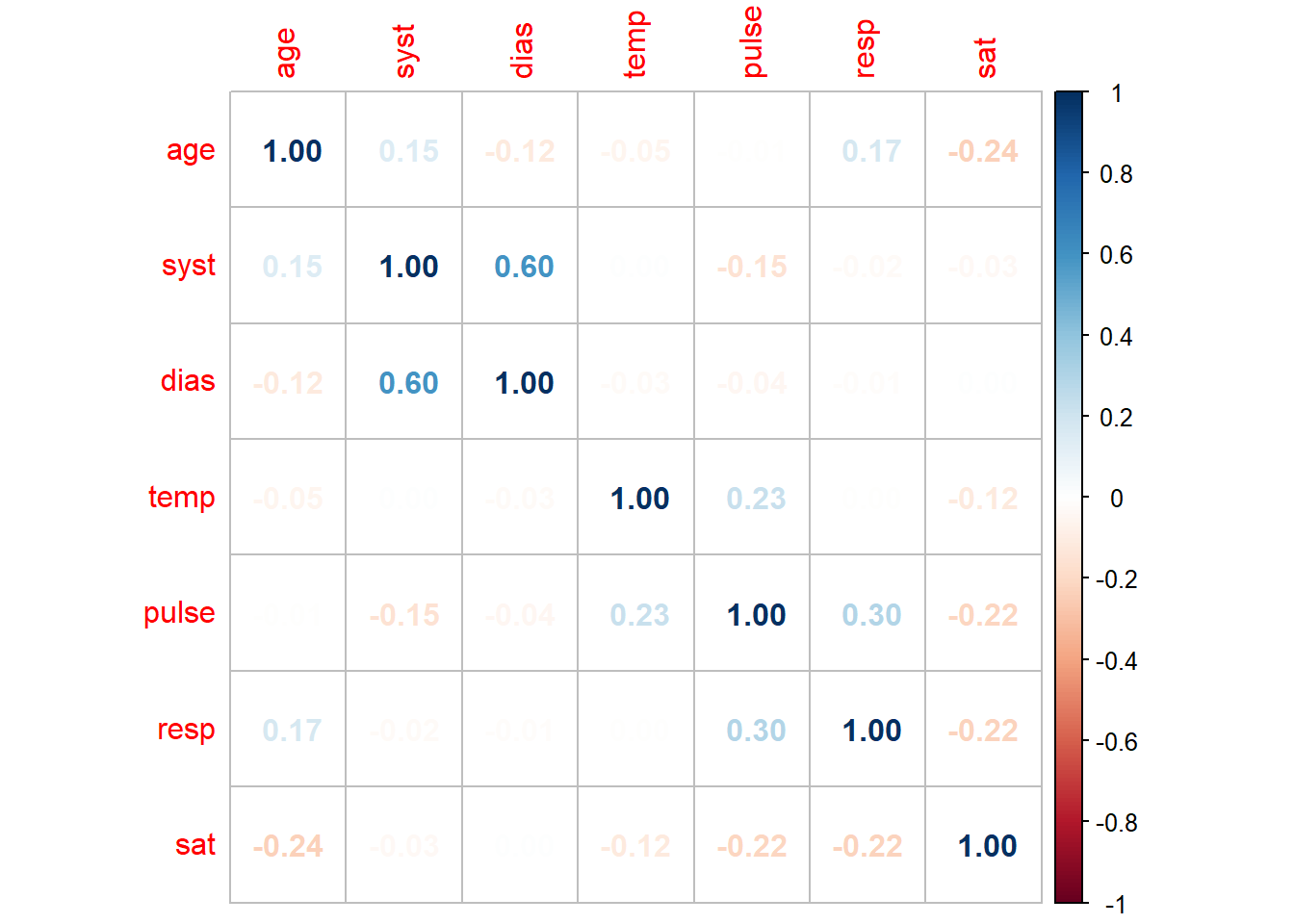
We can see in this plot we have limited strong correlations in our data. However, systolic and diastolic blood pressure have a strong positive relationship (as one increases, so does the other) whilst blood oxygen saturation and respiration have a weak negative relationship. This visualisation allows us to much more easily determine patterns in our dataset and determine which variables are correlated.
The corrplot function can take a wide range of arguments (to see them all you can run ?corrplot) which can change the visual properties of the visualisation created. In the code below we change the method argument to circle and create a more visually appealing graph whilst sacrificing some finer details.
#generates a circle corrplot
news_data %>%
  select(where(is.numeric)) %>%
  cor() %>%
  corrplot(method = "circle")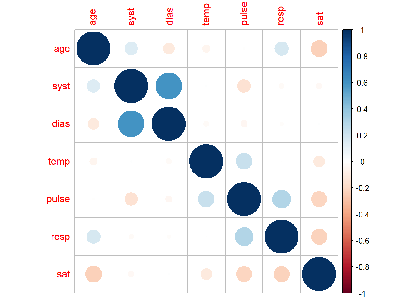
The corrplot package also offers a function corrplot.mixed which can be used if we want to combine the two visualisations above. This can bring together the benefits of both of the above graphs into one.
#generate a mixed corrplot
news_data %>%
  select(where(is.numeric)) %>%
  cor() %>%
  corrplot.mixed()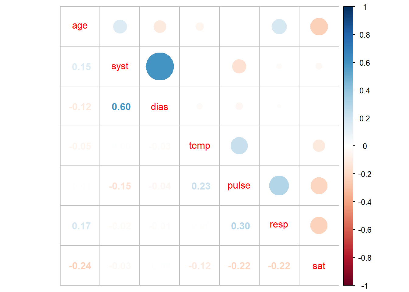
As mentioned earlier, there are a host of options in the corrplot package which are outlined here including the ability to add p-values as well as other visual changes.
Conclusion
Correlations are a very useful statistic to explore as part of an initial exploration of a dataset. After producing a correlation matrix, there are a number of ways to present this data that can make communicating your findings more effective.
Complete code
library(NHSRdatasets)
news_data <- synthetic_news_data
head(news_data)
#assigning synthetic news data to a dataframe called news_data
#investigate the dataframe using head

news_data$male <- as.factor(news_data$male)
news_data$NEWS <- as.factor(news_data$NEWS)
news_data$sup <- as.factor(news_data$sup)
news_data$alert <- as.factor(news_data$alert)
news_data$died <- as.factor(news_data$died)
head(news_data)
#convert variables from integer to factor variables
#as factor changes the type of data stored in the column but not the values
#head investigates the dataframe

cor(news_data$syst, news_data$dias)
#cor is a built in R function to generate a correlation

cor(news_data$syst, news_data$dias, method = "kendall")
#calculate a correlation using the kendall method

library(ggplot2)
library(magrittr)
library(dplyr)
news_data %>%
  ggplot(aes(x = syst, y = dias)) +
  geom_point() +
  geom_smooth(method = "lm", se = FALSE)
#examine the correlation between two variables visually using a graph

correlation <- cor.test(news_data$syst, news_data$dias) # using the base R cor.test function
correlation$p.value # using the $ operator to get the p-value from the list

news_data %>%
  select(where(is.numeric)) %>%
  cor()
#examine the correlation between all variables in the dataset
#the where function tells select to look across all columns for the condition specified within it

#as.matrix creates a matrix from the dataframe which is run through the rcorr function
library(Hmisc)
rcorr(as.matrix(news_data))

#as.matrix creates a matrix from the dataframe which is run through the rcorr function
library(Hmisc)
rcorr <- rcorr(as.matrix(news_data))
#saves the correlation matrix as an object

rcorr.coeff <- rcorr$r %>%
  round(digit = 3)
#this piece of code assigns the coefficients from the rcorr list into its own object
#the round() code makes the numbers easier to interpret by rounding to 3 decimal places

rcorr.p <- rcorr$P %>%
  round(digit = 3)
#this achieves the same result but now for the p values

library(kableExtra)
news_data %>%
  select(where(is.numeric)) %>%
  cor() %>%
  kable() %>%
  kable_styling()
#kable is a package that allows use to generate a more attractive looking table in R
#kable gives a basic kable table as an HTML table

library(corrplot)
news_data %>%
  select(where(is.numeric)) %>%
  cor() %>%
  corrplot(method = "number")
#generates a number corrplot

news_data %>%
  select(where(is.numeric)) %>%
  cor() %>%
  corrplot(method = "circle")
#generates a circle corrplot

news_data %>%
  select(where(is.numeric)) %>%
  cor() %>%
  corrplot.mixed()
#generate a mixed corrplot