TL;DR
The Bland-Altman plot (hereinafter referred to as BA-plot) is a useful tool to have within your data science toolbox. Developed as a way to overcome the short comings of only utilising correlations for agreement, it provides an overview of the mean agreement, the range (limits of agreement) and agreement over the entire range of the data.
Introduction
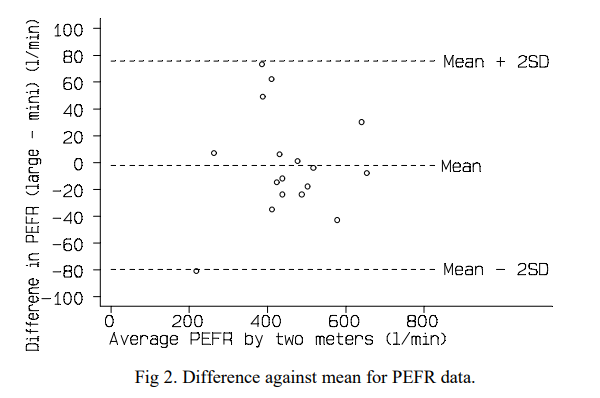
The BA-plot was first developed in 1986 by the very Martin Bland and Douglas Altman. It was devised as a away to better compare clinical measurements and to supplement the use of correlation for agreement, which in their words was “misleading”. We have inserted an example below that we have taken from one of the original papers to show you what we mean.
This post will assume you know a little bit about the plots but if you would like to read the original papers then please use the links below.
Calculating the data for the plot
The whole premise behind the BA-plot is that you are assessing agreement. The plots are a really useful tool when you want to assess the agreement of the same variable but it has been measured by different devices/tools (i.e. physical activity from two brands of accelerometer). For this to be conducted, you need to calculate a few variables from a paired set of data including the mean, the difference, the SD and then the limits of agreement (mean difference +- 2SD). So to begin, we will insert a bit of data into R which you can then calculate these variables. For this data set, we will step count data on 100 people that was measured by two different devices (pedometers) at the same time. We would normally ask you to read in the data as the data is a simple dataset, you can just copy and past the below code into R.
bdata <- data.frame(Device1 = c(17, 20, 13, 15, 22, 0,  2,  21, 21, 20, 20, 21, 19, 23, 15, 19, 21, 22, 19, 16, 20, 23, 21, 21, 21, 20, 24, 21, 20, 22, 25, 21, 20, 20, 14, 19, 26, 19, 21, 18, 16, 20, 20, 20, 20, 18, 15, 17, 20, 21, 21, 20, 21, 29, 19, 22, 20, 37, 22, 21, 23, 18, 16, 20, 20, 17, 20, 20, 19, 20, 25, 16, 26, 20, 22, 19, 23, 22, 22, 22, 20, 21, 20, 20, 18, 23, 18, 20, 20, 17, 22, 20, 25, 15, 19, 22, 21, 21, 29, 24), Device2 = c(17, 20,    18, 19, 21, 22, 8,  20, 21, 21, 22, 20, 17, 20, 14, 18, 24, 20, 19, 17, 20, 25, 20, 22, 20, 19, 20, 20, 21, 21, 21, 20, 21, 27, 22, 20, 21, 18, 22, 20, 14, 20, 18, 19, 17, 21, 19, 19, 14, 21, 20, 23, 22, 23, 22, 22, 20, 32, 19, 20, 26, 29, 13, 19, 20, 20, 20, 18, 23, 23, 23, 19, 24, 20, 20, 21, 22, 20, 21, 21, 20, 20, 20, 21, 22, 24, 18, 21, 23, 21, 22, 20, 15, 22, 21, 20, 20, 20, 27, 29))
#this is the data you will be using for this post
The test asked all individuals to put on both device and to walk 20 steps and then record the number of steps from both devices. Hopefully the first thing you notice is that there are slight differences between devices for all individuals. From these data, we can calculate the necessary variables to create a BA-plot. These are: - mean of both measurements: to indicate where the data point (measurement) should feature across the range of the data (x-axis) - difference: the difference between the two measurements. Take note of which way around you calculate this as this will influence the interpretation. - mean difference: the average of the differences between the two measurements. - standard deviation of difference: just as it sounds, the standard deviation of the differences between the two measurements. - upper error limit (95%): the upper limit where about 95% of measurements will fall on the plot - lower error limit (95%): the lower limit where about 95% of measurements will fall on the plot
To calculate these, you can use the following code:
library(dplyr)
bdata <- bdata %>%
  mutate(average = (Device1 + Device2)/2) %>%
  mutate(diff = Device1 - Device2)
#this code uses dplyr to calculate the necessary variables and insert them into the data frame

meandiff <- mean(bdata$diff)
sddiff <- sd(bdata$average)
limits <- sddiff * 1.96
upper95 <- (meandiff+limits)
lower95 <- (meandiff-limits)
#in contrast the previous code, this set of code create data objects as they are summary variables
#These will then then used to specify certain aspects of the plot code
#to use your own data, replace the variable names (Device1/2) and data frame (bdata) references above with your own
Creating the plot
Now you have calculated all the necessary variables for the plot, it is time to again the ggplot2 packages to visually depict the results. We will create a standard BA-plot (scatter) with mean difference, upper limit and lower limit lines.
library(ggplot2)
#this code uses all of the variables you have calculated to create the BA-plot
#the average between the two devices is plotted on the x axis and the difference on the y axis
#to geom_hline code creates the 3 lines you see on the plot by inserting the variables names
#the plot will be initially be rendered to the y axis limits that exists within the data
#however, the y axis limits on BA-plots should be equal to aid in their interpretation
#to do this it is best to initially render the plot and then impose your own y axis limits
#you may also wish to change the tick marks of the x and y axes to help you better interpret the results
#if you remove the # symbols from the last few lines of code and enter the values (already decided for you), this should create a balanced plot and change the tick marks
#when using this code for your own data, these will need to be edited
#finally, the theme() code removes the x axis title for better styling
ggplot(bdata, aes(x = average, y = diff)) +
  geom_point() +
  geom_hline(yintercept = upper95, linetype = "dashed", colour = "red") +
  geom_hline(yintercept = lower95, linetype = "dashed", colour = "red") +
  geom_hline(yintercept = meandiff, linetype = "solid", colour = "black") +
  #scale_x_continuous(limits = c(0,40), breaks=seq(0,40,by=5)) +
  #scale_y_continuous(limits = c(-30,30),breaks=seq(-30,30,by=5)) +
  theme(axis.title.x=element_blank())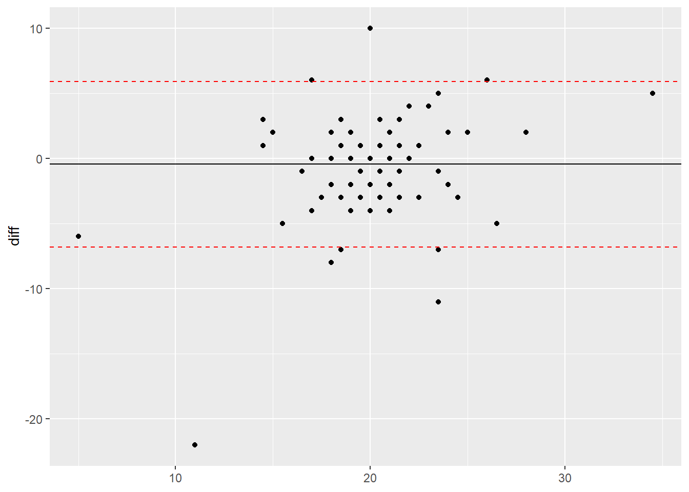
Plot interpretation
Once you have generated the plot, you can interpret the results. Whilst a full interpretation is beyond the scope of this post, here are a few pointers:
- The mean difference - the mean difference is negative meaning that on average, the second device recorded a higher value over 20 steps than the first device. This is why it is important to know what way around you calculate the difference as this helps you interpret the results.
- The limits of agreement (95%) - this means that the 95% of the differences between the two devices could fall between -7 and +6. In this case, the numbers represents steps and it is important not to just rely on the numbers but use your knowledge and understanding of the literature to know if this range is a lot, within the error rate of the devices or really quite small.
- The spread of the data points - when looking at the plot all data points should ideally be spread equally along the range of the x axis and fall equally within the limit lines. If they do not, this could indicate a proportional error within your data. This basically means that the error observed could increase or decrease as values increase or decrease and not equally along the range of values. To read up on this, we would recommend the following link: Atkinson & Nevill (1998).For this plot, the points look relatively evenly spread along the x axis.
- Overall interpretation - after taking into account all of the above points, it appears that there is a systematic error of -0.45 steps between the two devices and the second device could record up to 7 more or 6 fewer steps than the first device. Whilst this may not sound a lot, as this test was only over 20 steps, this amount of error could add up over the day. Therefore in this case, if the first device was considered the ‘gold standard’, you could question the validity of the second device when comparing it to the first.
These are the basic aspects for you to understand when it comes to the BA-plot. Hopefully when you generate a plot using your own data, it will become a bit clearer what all of these aspects mean.
Extending the plot
There are many different aspects of a ggplot plot that can be altered in order to change the appearance such as adding axis labels, but we will leave you to explore these using the other posts as a guide. However, there is one thing that can be done to make these plots more interactive and intuitive. By using the plotly package, you can create an interactive html plot which then allows you to hover over data points (to view the values) and also to zoom in and out of the plot. To do this you have to wrap the entire code within the plotly function.
library(plotly)
#you may have to install this via install.packages("plotly")
#the code is the same apart from enclosing the code with ggplotly(CODE)
ggplotly(ggplot(bdata, aes(x = average, y = diff)) +
        geom_point() +
        geom_hline(yintercept = upper95, linetype = "dashed", colour = "red") +
        geom_hline(yintercept = lower95, linetype = "dashed", colour = "red") +
        geom_hline(yintercept = meandiff, linetype = "solid", colour = "black") +
        scale_x_continuous(limits = c(0,40), breaks=seq(0,40,by=5)) +
        scale_y_continuous(limits = c(-30,30),breaks=seq(-30,30,by=5)) +
        theme(axis.title.x=element_blank()))
Use your mouse to interact with the plot to view value and zoom in. To reset the plot, click the home symbol at the top right of the plot area.
Conclusion
So there we have it. We have just been through how to generate the variables required a BA-plot, how to generate the plots and how to interpret them. Whilst many people quite rightly use them as a robust way to measure agreement, they are also just a tool and should be carefully interpreted, using your knowledge of the field and the measurements that you are assessing. To calculate these on your own data, replace the variable names in the code with your own and you should be good to go!
Complete code
bdata <- data.frame(Device1 = c(17, 20, 13, 15, 22, 0,  2,  21, 21, 20, 20, 21, 19, 23, 15, 19, 21, 22, 19, 16, 20, 23, 21, 21, 21, 20, 24, 21, 20, 22, 25, 21, 20, 20, 14, 19, 26, 19, 21, 18, 16, 20, 20, 20, 20, 18, 15, 17, 20, 21, 21, 20, 21, 29, 19, 22, 20, 37, 22, 21, 23, 18, 16, 20, 20, 17, 20, 20, 19, 20, 25, 16, 26, 20, 22, 19, 23, 22, 22, 22, 20, 21, 20, 20, 18, 23, 18, 20, 20, 17, 22, 20, 25, 15, 19, 22, 21, 21, 29, 24), Device2 = c(17, 20,    18, 19, 21, 22, 8,  20, 21, 21, 22, 20, 17, 20, 14, 18, 24, 20, 19, 17, 20, 25, 20, 22, 20, 19, 20, 20, 21, 21, 21, 20, 21, 27, 22, 20, 21, 18, 22, 20, 14, 20, 18, 19, 17, 21, 19, 19, 14, 21, 20, 23, 22, 23, 22, 22, 20, 32, 19, 20, 26, 29, 13, 19, 20, 20, 20, 18, 23, 23, 23, 19, 24, 20, 20, 21, 22, 20, 21, 21, 20, 20, 20, 21, 22, 24, 18, 21, 23, 21, 22, 20, 15, 22, 21, 20, 20, 20, 27, 29))
#this is the data you will be using for this post

library(dplyr)
bdata <- bdata %>%
  mutate(average = (Device1 + Device2)/2) %>%
  mutate(diff = Device1 - Device2)
#this code uses dplyr to calculate the necessary variables and insert them into the data frame

meandiff <- mean(bdata$diff)
sddiff <- sd(bdata$average)
limits <- sddiff * 1.96
upper95 <- (meandiff+limits)
lower95 <- (meandiff-limits)
#in contrast the previous code, this set of code create data objects as they are summary variables
#These will then then used to specify certain aspects of the plot code
#to use your own data, replace the variable names (Device1/2) and data frame (bdata) references above with your own

library(ggplot2)
ggplot(bdata, aes(x = average, y = diff)) +
  geom_point() +
  geom_hline(yintercept = upper95, linetype = "dashed", colour = "red") +
  geom_hline(yintercept = lower95, linetype = "dashed", colour = "red") +
  geom_hline(yintercept = meandiff, linetype = "solid", colour = "black") +
  #scale_x_continuous(limits = c(0,40), breaks=seq(0,40,by=5)) +
  #scale_y_continuous(limits = c(-30,30),breaks=seq(-30,30,by=5)) +
  theme(axis.title.x=element_blank())
#this code uses all of the variables you have calculated to create the BA-plot
#the average between the two devices is plotted on the x axis and the difference on the y axis
#to geom_hline code creates the 3 lines you see on the plot by inserting the variables names
#the plot will be initially be rendered to the y axis limits that exists within the data
#however, the y axis limits on BA-plots should be equal to aid in their interpretation
#to do this it is best to initially render the plot and then impose your own y axis limits
#you may also wish to change the tick marks of the x and y axes to help you better interpret the results
#if you remove the # symbols from the last few lines of code and enter the values (already decided for you), this should create a balanced plot and change the tick marks
#when using this code for your own data, these will need to be edited
#finally, the theme() code removes the x axis title for better styling

library(plotly)
ggplotly(ggplot(bdata, aes(x = average, y = diff)) +
        geom_point() +
        geom_hline(yintercept = upper95, linetype = "dashed", colour = "red") +
        geom_hline(yintercept = lower95, linetype = "dashed", colour = "red") +
        geom_hline(yintercept = meandiff, linetype = "solid", colour = "black") +
        scale_x_continuous(limits = c(0,40), breaks=seq(0,40,by=5)) +
        scale_y_continuous(limits = c(-30,30),breaks=seq(-30,30,by=5)) +
        theme(axis.title.x=element_blank()))
#you may have to install this via install.packages("plotly")
#the code is the same apart from enclosing the code with ggplotly(CODE)